Thursday 28 February 2013

Flowcharts


Hierarchy


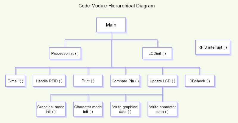
A hierarchical chart is described as a visual representation of a system of hierarchy and can also be referred to as a structure chart. Roles, ranks or positions are clearly laid out in an illustrated format that depicts the relationship between the elements. The top of the chart is generally reserved for the most important or significant part of the system of hierarchy. Cascading down from the top are other components of the system hierarchy.

Linear 


Linear search is a sequential search is a method for finding a particular value in a list, that consists of checking everyone of its elements, one at a time and in sequence, until the desired one is found. A diagram representation  that uses graphic symbols to depict the nature and flow of the steps in a process. Each process is represented by different symbols, linear symbols are normally linked together with arrows showing the flow direction.


Inspirational Multimedia..


I have been looking into other websites which have elements of good multimedia which I would like to use within my own design.

http://www.socketstudios.com/#work1
  • Clean and crisp
  • Smooth slider
  • Big images work well
  • Easy to navigate 
  • Design relates to company
  • Knew what it was straight away
http://www.drxlr.com/2013/
  • Nice colour change
  • Simple yet effective
  • Easy to navigate
  • Shame the logo has been cropped out
  • Doesn't stay with web design rules
  • Unique
http://charactersf.com/
  • Nice automatic slider
  • Simple colours
  • Easy to use layout
  • Big images work well
  • Clean and crisp
http://www.no-bo.co/
  • Simple design
  • Easy to use
  • Nice colour schemes
  • Scroll down is repetitive
  • Slider half way through is surprising but good

http://demicreative.com/
  • Lovely welcome page
  • Scroller is original
  • Use of images works well
  • Video is refreshing

multimedia website presentation


As the next stages of this module is to start thinking about the multimedia you would like to include. During this lecture me and Amelia looked at two websites which had good elements of multimedia.

These are the examples we found : 


  • Welcome page is intriguing 
  • The website is really interactive
  • Goes against website design rules
  • Simple yet effective animations
  • Nice illustration style
  • Child friendly, primary colours
  • Simple to follow
  • Music can get annoying (option to turn it on and off)
http://www.theoleg.com/hes/

  • Welcome page clean and crisp
  • Interesting pop ups when hovering over
  • Easy to navigate
  • Music is relaxing
  • Games within website
  • Pop up noises don't need to happen every time
  •  Scrolling image is smooth
  • Many options
Bearing this is mind I will be looking at other examples to help me develop my website.

Wednesday 20 February 2013

More websites..


During lesson we looked at several websites and we was asked to take notes and ask what we liked and what we didn't like.

www.lessrain.com

The start up page wasn't clear at first, I thought it was a holiday website. However when I found out what it was about, it came clear that they was just thinking outside the box and not sticking to website designing rules. The home page is exciting and captured my attention. The reasoning behind this was because of the big image. There isn't a lot of text which makes the website clear and crisp. As I looked deeper into the website I found viewing their work easy and clear, the only issue I had was you can't preview the images any bigger than they are on the website.

www.wonder-wall.com

This website at first is confusing, but it grown on me the longer I stayed on the website. It's whacky and quirky, this style relates to their interior design. Its direct and easy to use and the inner pages are easy to navigate. The inner pages are also clean and crisp which is strange as it steers away from their style, however it works nicely.

www.gotmilk.com

This website is very interactive, it includes a game. Some of the elements are very funny. Its user friendly, crisp and clean. The multimedia elements work well and they don't buffer which encouraged me to stay on the website longer. It tells you about milk and they are many options to choose from and I personally learnt whilst on this website. Its flash based, normally flash can be slow however it brings a standard product to life.

Development..


After a tutorial I had with my lecturer, I was told that my website didn't look professional and looked rather tacky. I agreed with this factor, so during this week I have been revamping my website. I wanted to have a nice header and I wanted to keep the rest simple. I began looking at other websites with patterns as the headers and this helped me develop my website. Most of them were templates for other blog's, so bearing this in mind I began designing in my sketch book.

I have produced a pattern which flows like water and relates to nature.


I feel this looks a lot better than my first draft, last semester I went straight into my first idea which was a big mistake, I will try and make my pattern move when I move onto the multimedia side. As I develop this I will be researching into other similar websites to help me. 

Wednesday 21 November 2012

Logo Ideas


I have decided to develop the logo further as i think the original logo is outdated. I started with scanning in my drawn idea however this didn’t look good on computer which was a shame. So I began experimenting with typography. I created outlines so I could put my personal touch on the type itself. I have kept to a blue colour scheme,. Whilst experimenting I have used gradients tints, type on path tool. The reason I used the type of path tool is because I wanted my text to glide and make it look more like water without adding the blue colour as my background is already blue.  Another effext I have used is the brush tool, this gave my logo a nice rough look however I feel ths doesn’t relate to the product itself. 

Tuesday 20 November 2012

Diagram Development


I have produced the diagram in Adobe Illustrator, this has been taken from the original however I will be changing the colour schemes in the next week however I feel that this is a decent looking diagram as it is but I would like to be my own stamp on it. So I will be changing the bacteria to a green, and I have produced the water flow using the brush tool in Adobe Illustrator. I think this is quite effective. I could of used the original image however I wanted to use Illustrator to add my own touch to the website. 


This is my final diagram, I felt green worked better than red in my own personal opinion. The original diagram had arrows that shown what each element however I felt that wasn't needed. As they are already instructions of how it works on the page I don't feel it needs to be repeated.